
| Year | Project Type | Platform | Role |
|---|---|---|---|
| 2024 | B2C | Mobile |
Product Designer
UX Designer Illustrator |
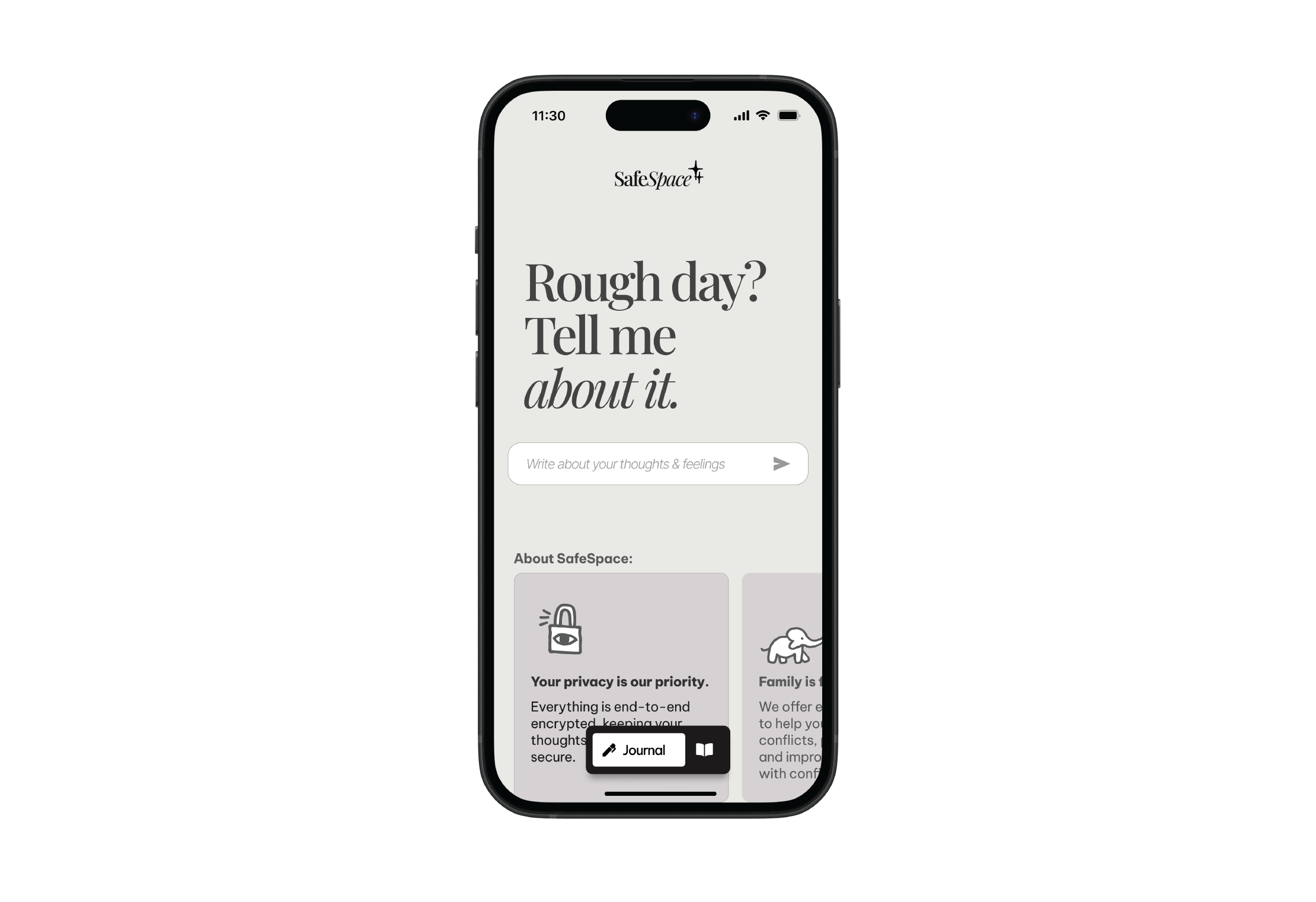
Do you avoid your flatmate? Did your boss scream at you? Just noticed a red flag from your partner? Knowing what to do in these scenarios it’s hard and not all of us are ready to confront them. The stress provoked by these, can undermine our mental well-being and provoke anxiety and depression. SafeSpace can help you deal with these kinds of emotional and communication problems. Let me show you how!
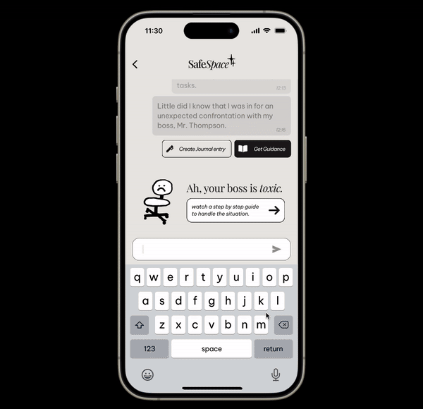
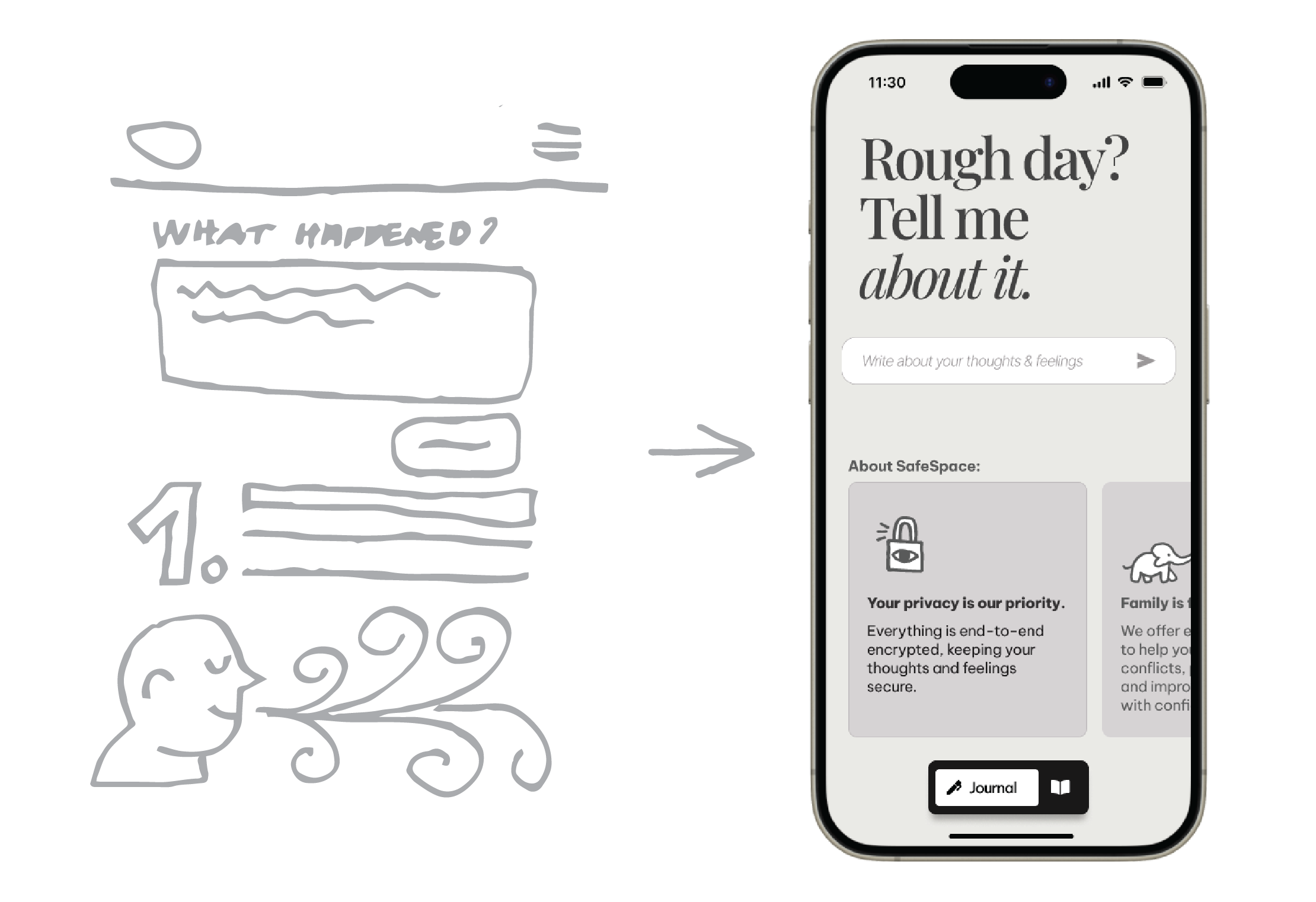
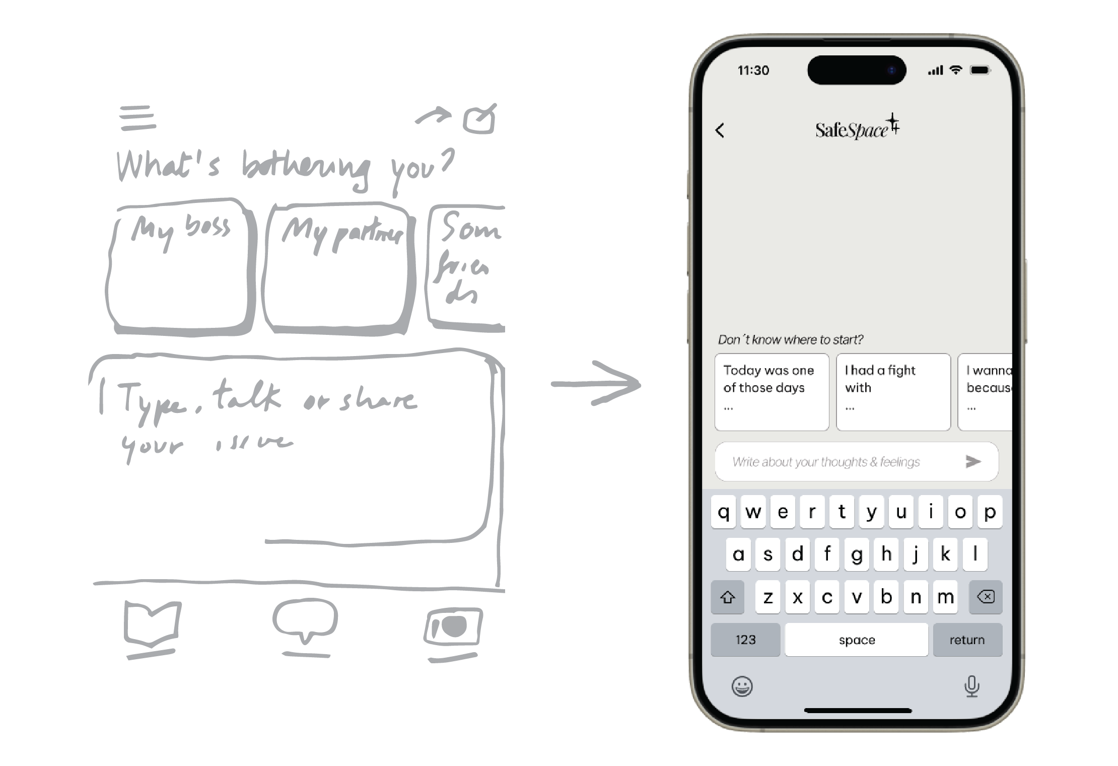
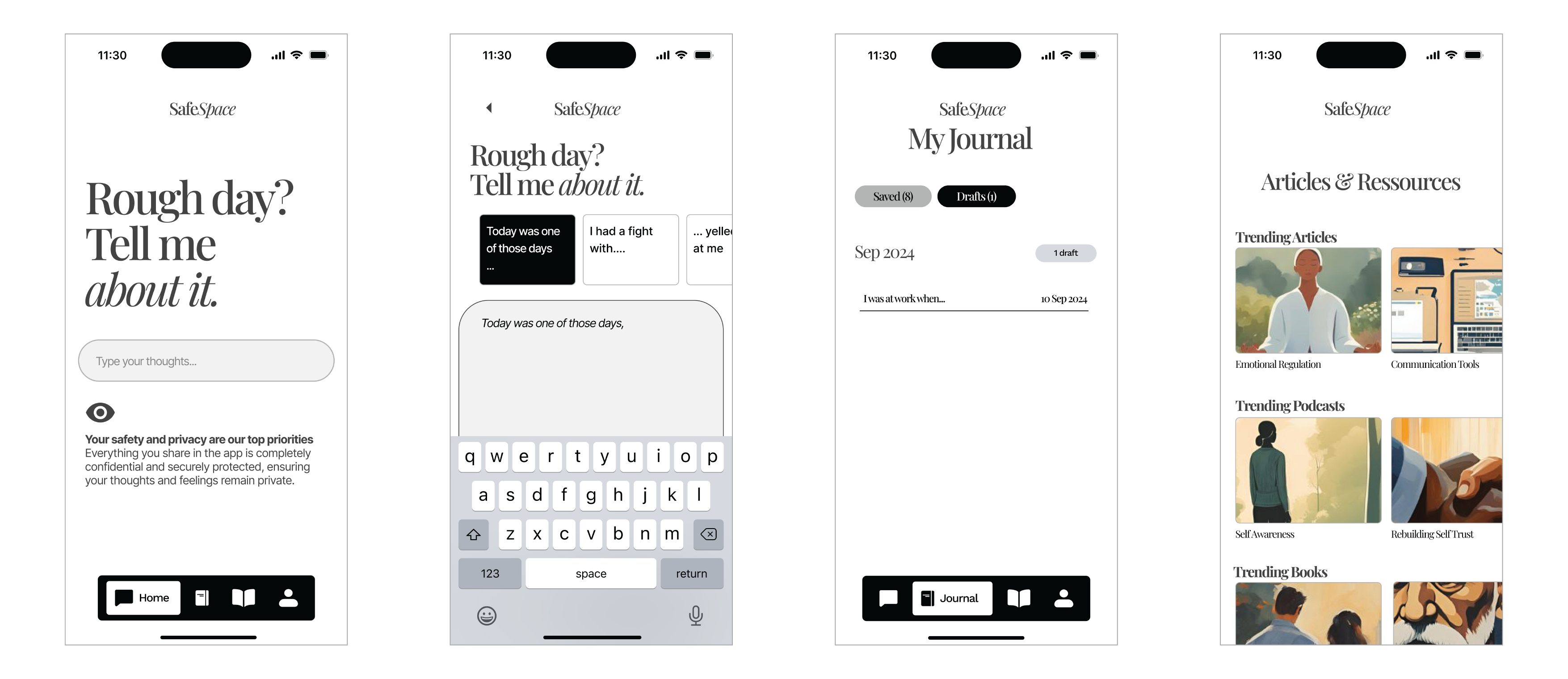
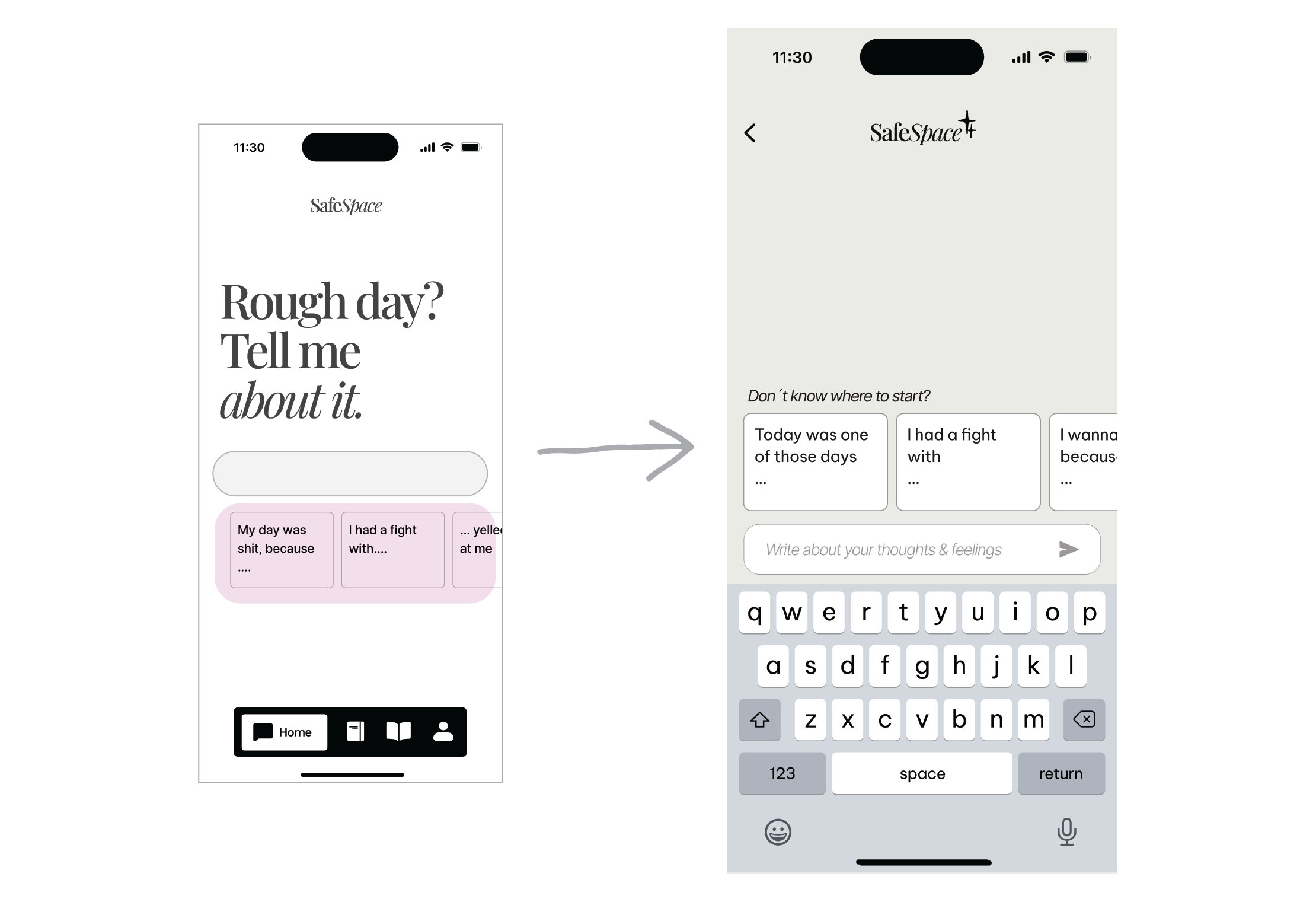
After a bad day in the office, Emma (Persona) keeps thinking about what happened. It was a stressful week and her boss yelled at her. She likes her job and the team and actually, her boss is not bad at all… but she doesn’t know what to do, ignore it, talk it through, or go to HR… She opens SafeSpace and types how she feels.
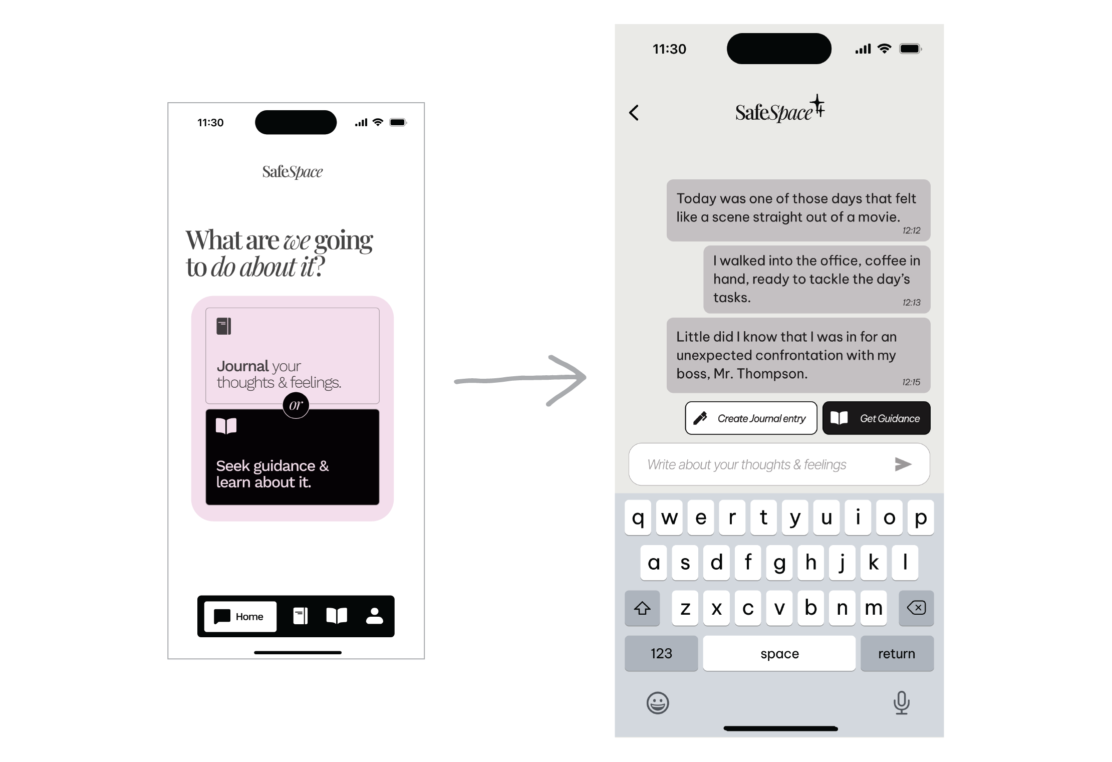
After her inquiry, SafeSpace creates an illustrated guide with actions she can take to improve her situation.
Personal writing helps Emma process emotions, reduce stress, improve self-awareness, and enhance clarity in decision-making and communication.
From the UX research I gathered some keywords that resonated in my
head while I started sketching. Here are some of them:
- Vault, private journal
- Personalized content
- Safe environment
- Guide, learn
- Shared consciousness
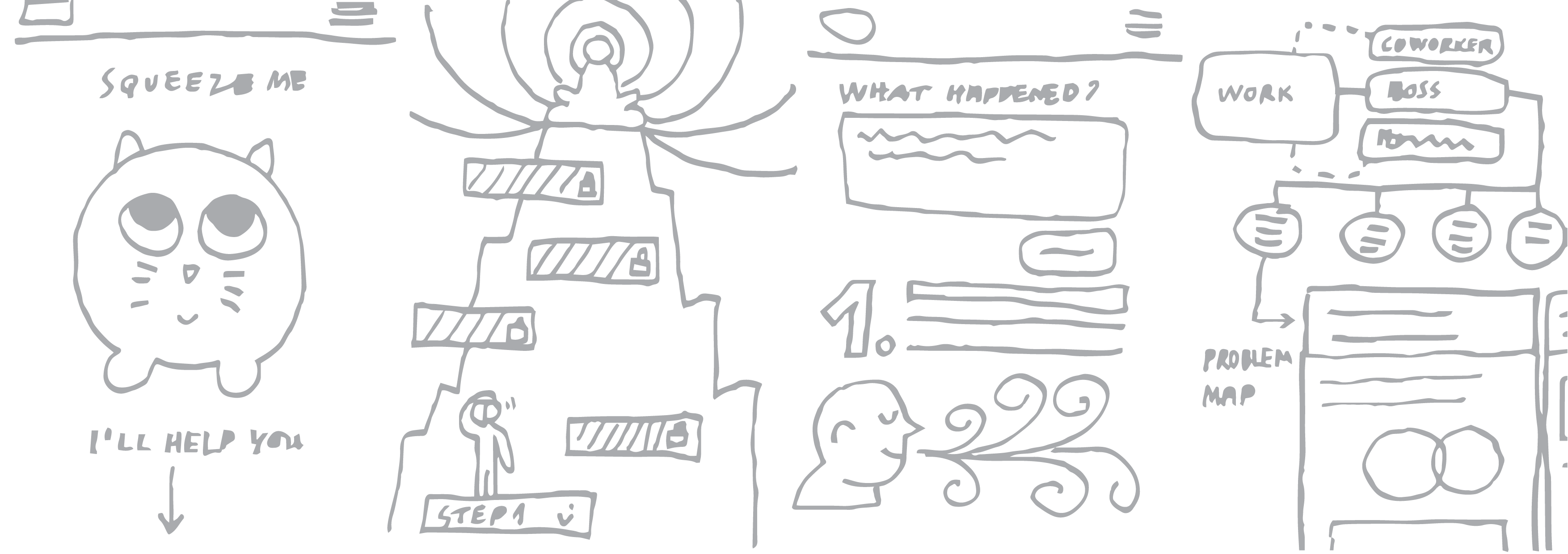
Like the secret for all good sauces, reduction. All along the design process there is always the impulse to add things, more features, more buttons, more utilities. To end up with a Swiss knife app that does nothing right. Here are some examples of dismissed ideas:
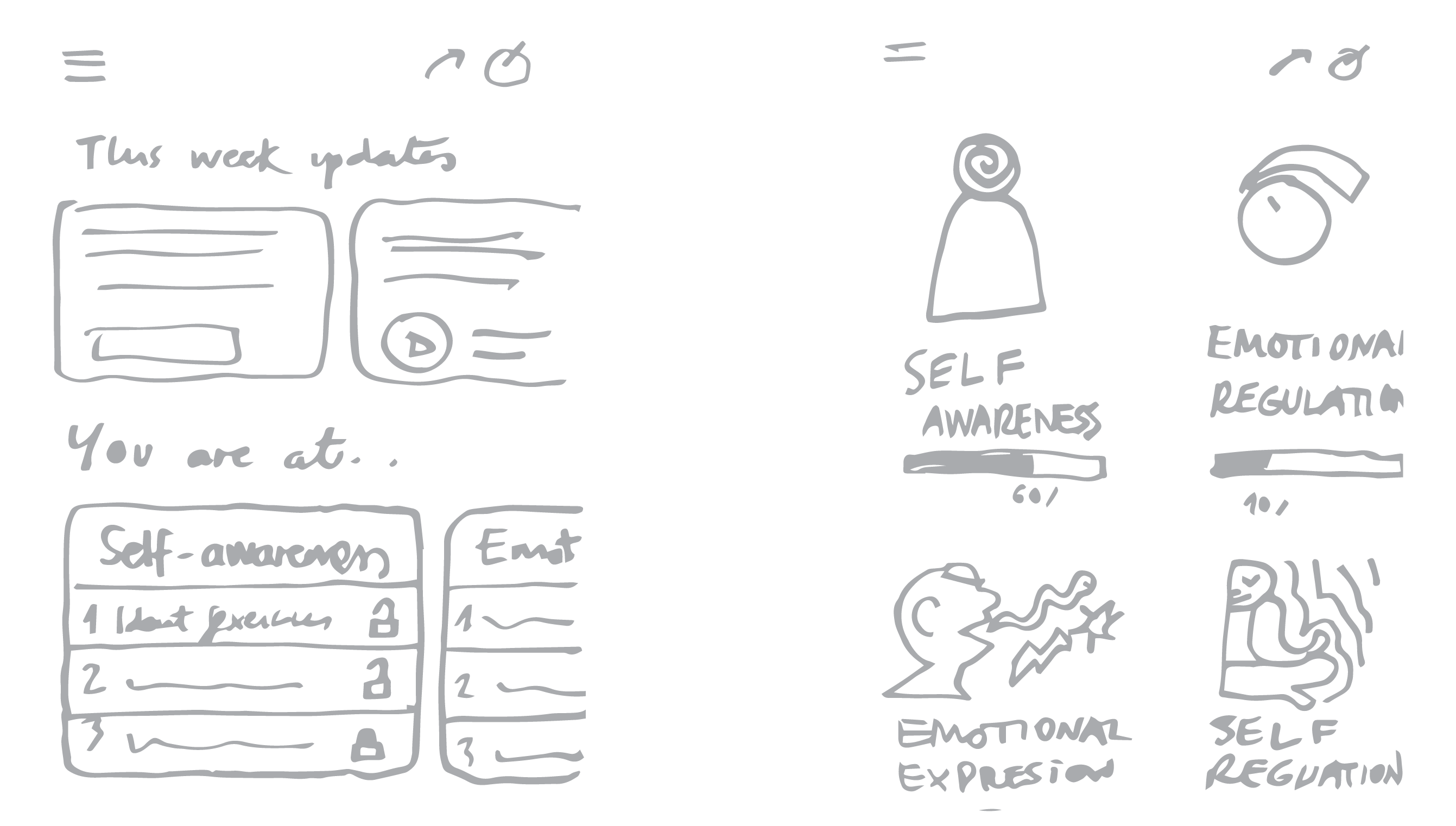
Gamification of the learning process can be useful to keep users coming back, but in this case was a distraction from the real goal: Help users with their conflicts.
After the usability test, the user felt confused by the navigation and didn’t know where the notes were or if he had finished the task. I tried to simplify more the options for the user, so it wouldn’t get confused. The idea of a switch between two modes (main actions) came to me… Was a decision pretty close to the delivery date, which meant extra work/stress, but I don’t regret it at all!
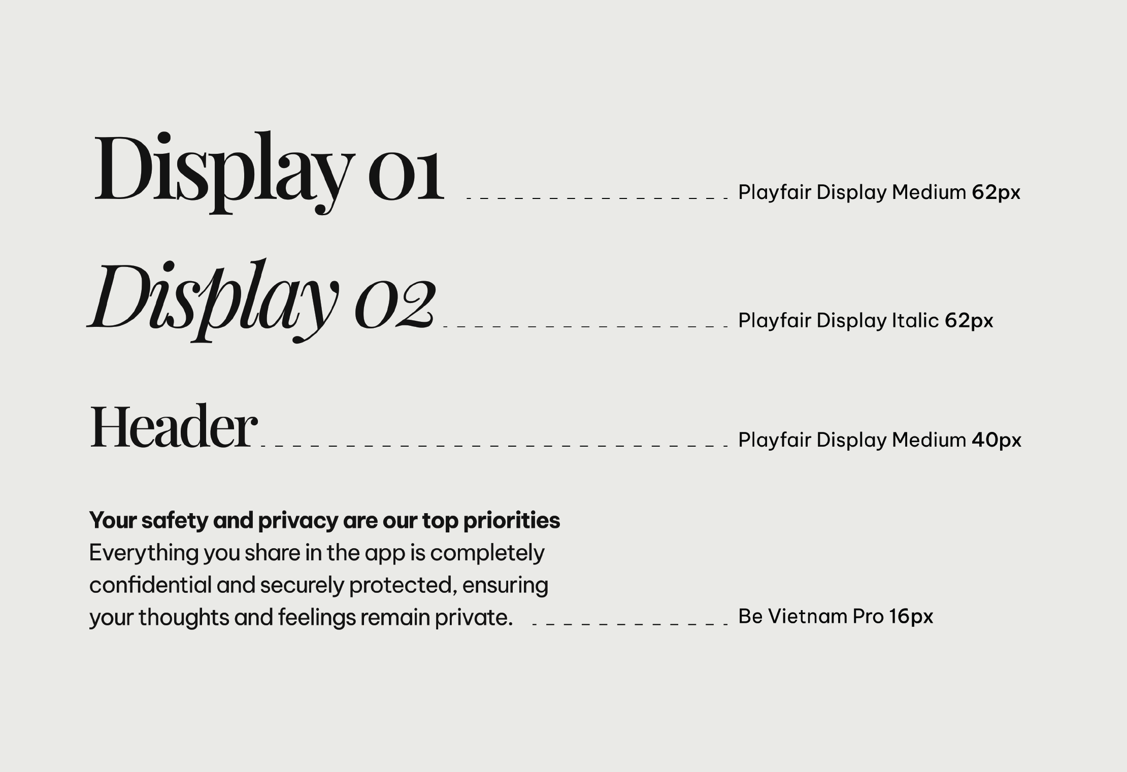
SafeSpace brand has to feel calm, secure, and trustworthy. That’s why its type is elegant and functional.
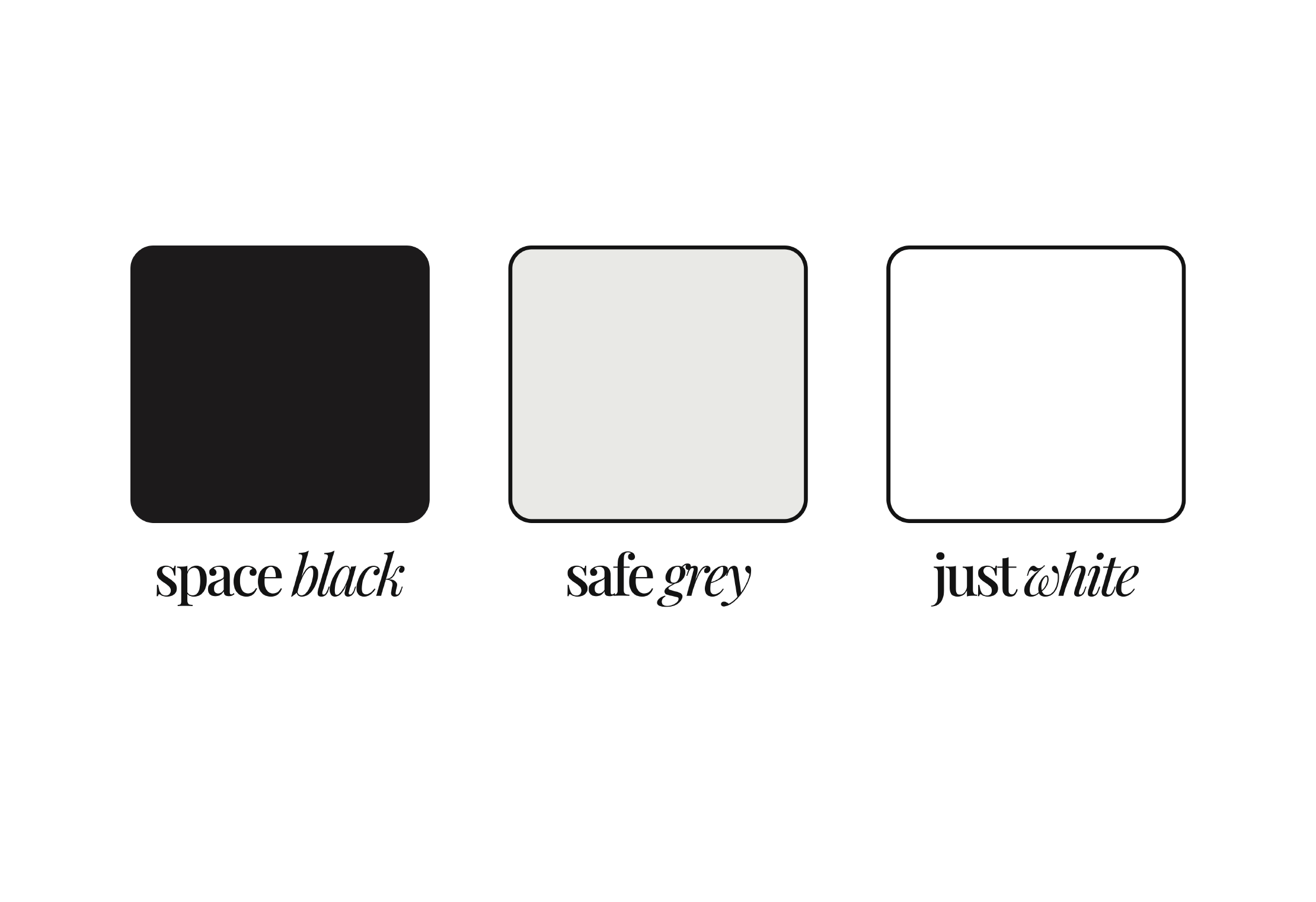
Colors are useful to convey feelings and most of products use them wisely, like Calm, a meditation and sleep app, predominantly uses shades of blue and green to evoke feelings of relaxation and tranquility. But I wanted to look as neutral as possible, plus I got really good feedback from users when showing it to them: “It looks professional and trustworthy!” One said.
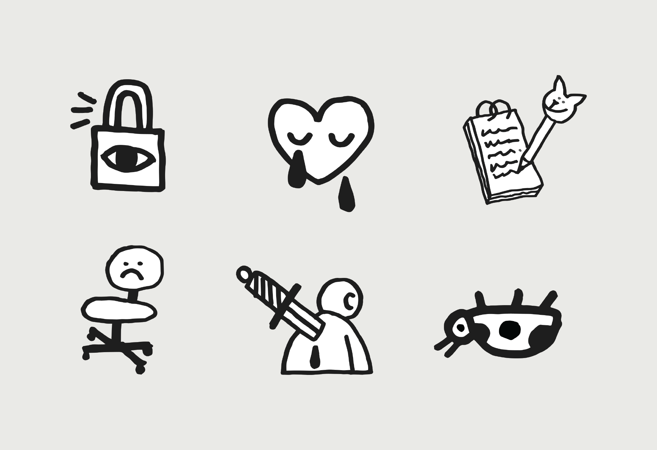
Incorporating humor and hand-drawn illustrations creates a more approachable, relatable experience, helping users feel at ease and fostering a deeper sense of trust.
Coded by Luis Alonso 2024.
© All rights reserved.