
| Year | Project Type | Platform | Role |
|---|---|---|---|
| 2024 | B2B | Desktop | Product Designer
UX Designer |
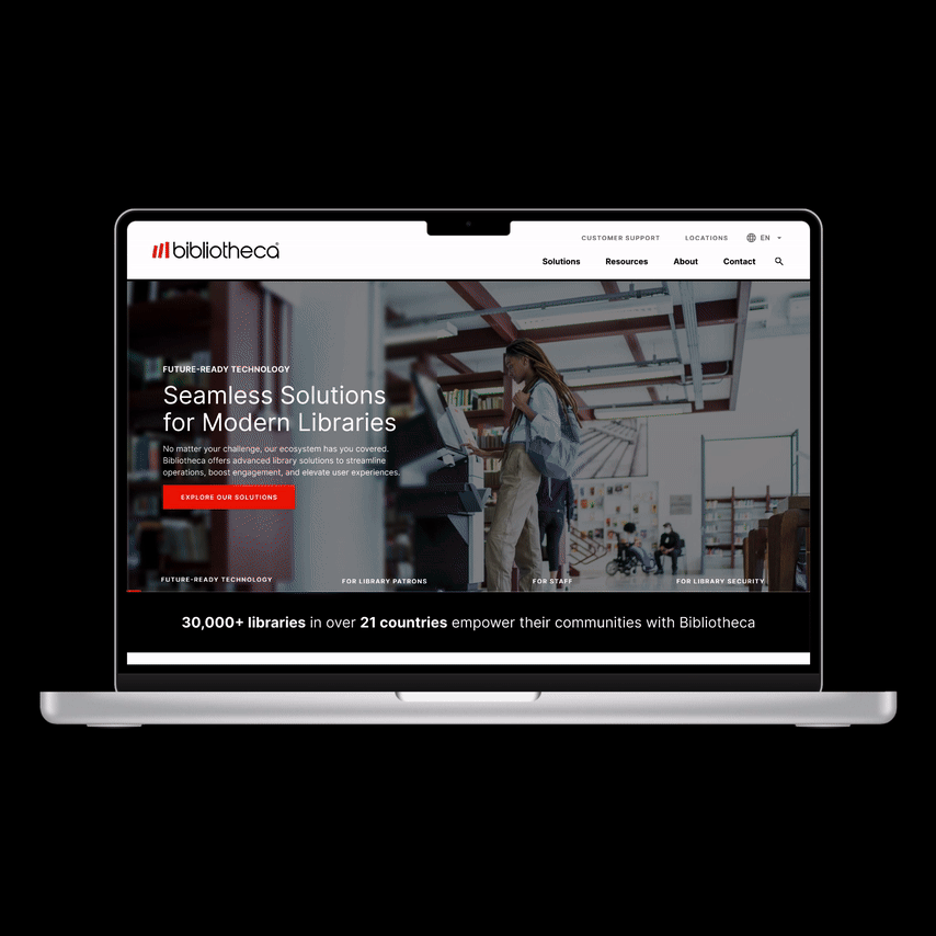
Bibliotheca is a global leader in library technology, with solutions installed in over 30,000 libraries in more than 21 countries. They are specialized in improving visitors' experience, staff productivity and library security. It's been a while since they redesigned their .com (2020), and now we were asked to give it a go!
The whole process included: stakeholder interview, research, ideation, usability testing, wireframing and prototyping. And took two weeks to get done.
After a meeting with Bibliotheca's stakeholders and going through their site, we put together these notes:
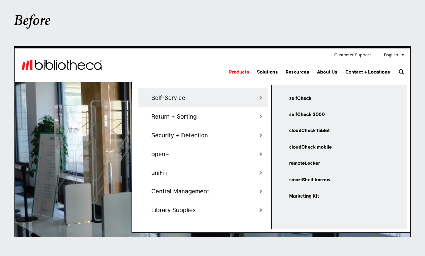
Stakeholders mention they were not happy with their hero section because " it doesn't communicate well what we do".
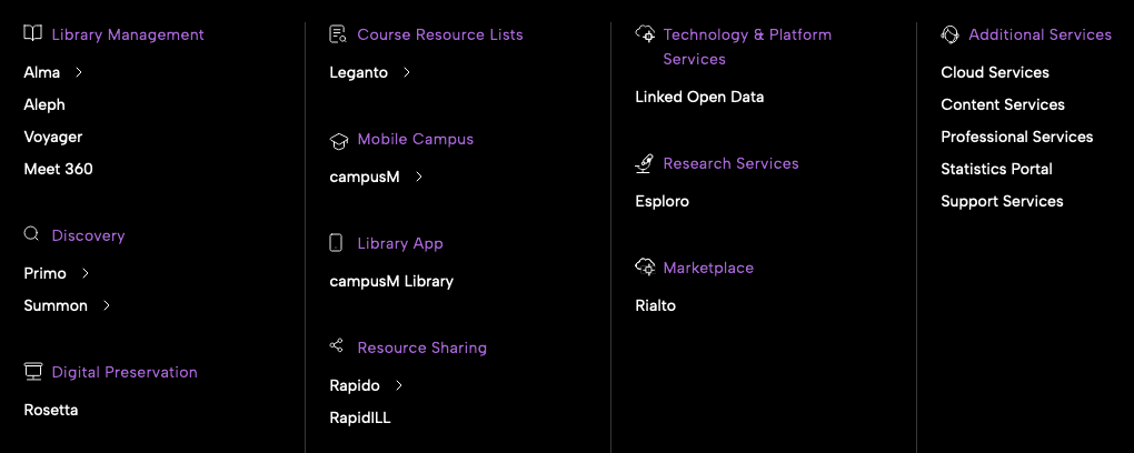
Stakeholders got some feedback on the navigation menu. Users couldn't find products quickly.
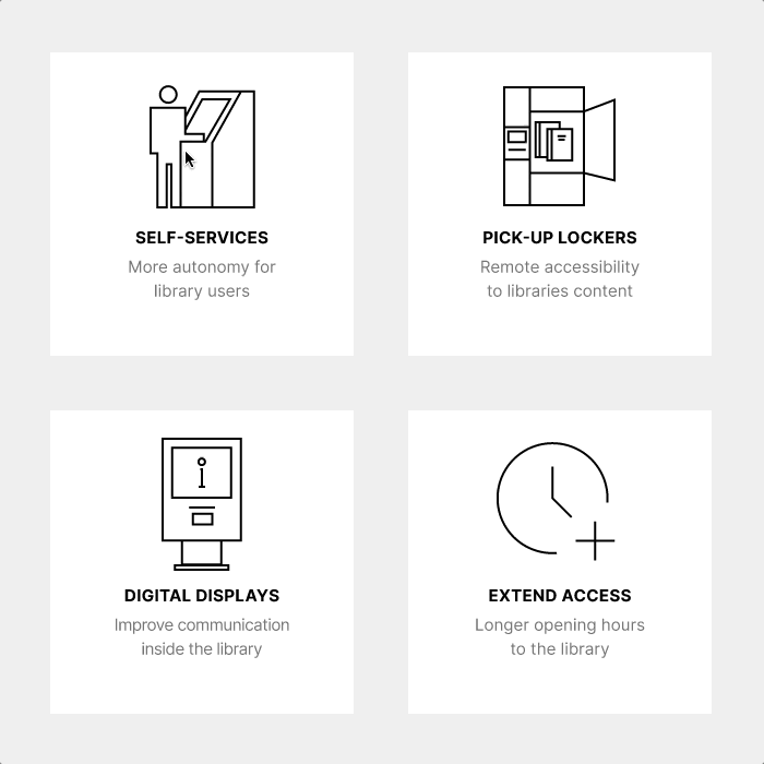
Most images, videos and blog posts are great, just not well organized.
The team at Bibliotheca couldn't say what metric would be measured to validate the design changes.
A big red flag raises in any designer's mind when working on a project where success metrics are not set. This means either the stakeholder doesn't trust you or they don't even track performance. A project without success metrics will fail because: Unclear goals, scope creep, limited accountability, reduced team motivation and inefficient resource allocation. I really recommend having some success metrics and goals!
These are three of the direct compeptitors of Bibliotheca. Was interesting to focus on three things from them:
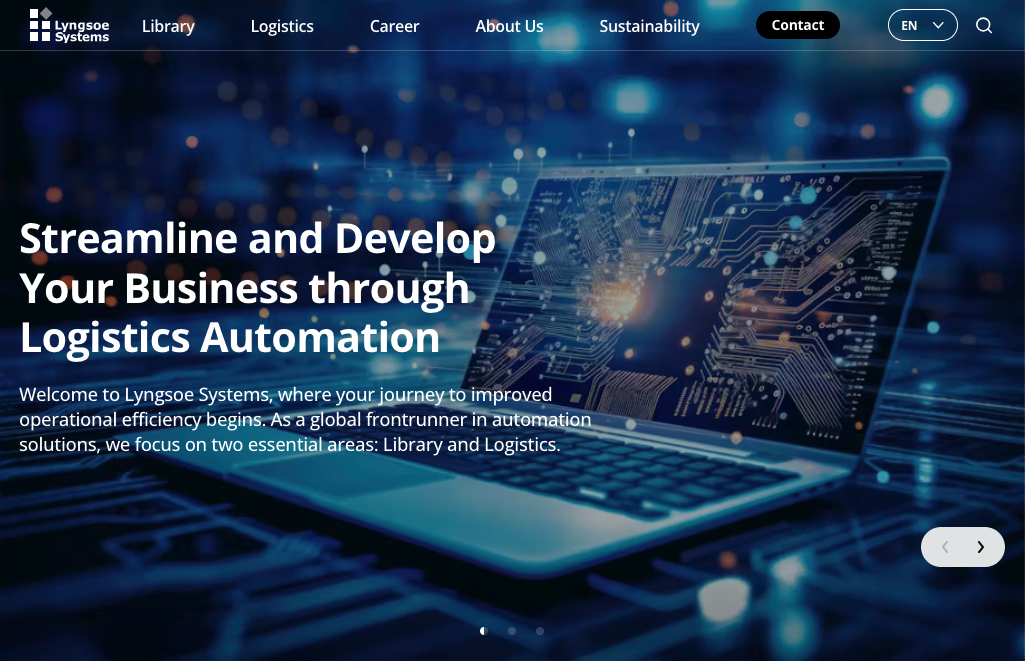

As soon as we saw other competitors' pages we realised Bibliotheca's needed an update.


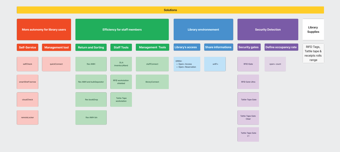

Applying Hick's Law, we reduced and group items in the menu to improve the user experience. We also kept the dropdowns closed so we could have Progressive Disclosure of them.

With our mid-fidelity prototype ready, we ran usability tests with 7 non-target users to gather some fresh insights.
💎 Key Takeaways:
We made additional tweaks to our prototype and brought it to 4 target users for usability testing. Their reactions were incredibly encouraging:
Gwyneth, Head of Global Customer Education
Lori, Customer Education Specialist
Setting success metrics from the start keeps everyone focused on what really matters and makes it easy to see if the design is hitting its goals. Not having any metrics is wasting money and time from everyone involved.
Knowing how the company attracts clients and understanding their user journey helps the team design experiences that truly connect with users, meeting their needs every step of the way. Creating new business opportunities through all the touchpoints.
Talking about design here: Being this a group project and as we had to decide on what kind of solutions and visual directions to take. I found myself agreeing to concepts or designs that I'd rather not use. But for the sake of moving on and meeting the deadline, I agreed to do.
First, I think our proposal is functional and meets the expectations, but doesn't look 2024 to me. And less if we think on the kind of company Bibliotheca is. I would have picked a more tech/future/science look.
For the funtionality of the homepage: I'd go further and explore solutions like a catalog/menu interface. Try to unify the menu, the solution boxes and the product catalog. And maybe in the near future work on features like: a budgeting tool, training portal or a 3D planner.
Working as a designer for Bibliotheca gives you the chance to impact how libraries engage with their communities and enhance access to knowledge. While you might think it could be dull since it’s all about libraries, you’ll find it’s a rewarding way to channel your creativity into something that genuinely makes a difference!
Coded by Luis Alonso 2024.
© All rights reserved.