
| Year | Project Type | Platform | Role |
|---|---|---|---|
| 2024 | B2C | Desktop | Product Designer
UX Designer |
This is a group project part of the UX/UI Design Bootcamp at Ironhack. Two more designers and me worked on it for two weeks. The process included: stakeholder interview, research, ideation, usability testing and prototyping.
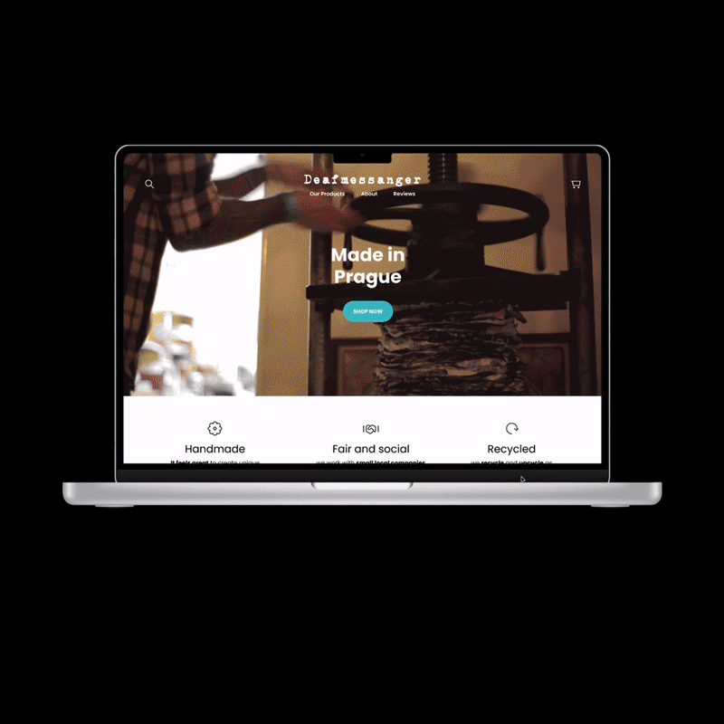
Deafmessanger is a small Notebook manufacture company based in Prague. They started in 2005 selling self made notebooks and diaries, now they sell to 50 shops worldwide. In the last years they have been focusing on B2B and left their website parked, now it’s time to improve their e-commerce site!
On my conversation with Deafmessanger team, they were already aware of some of the main issues with their site:
Deafmessanger’s brand is well-defined and it’s mirrowed on their products, you can recognize them a mile away! But not their website...
We grouped the insights from the talks to the users in this groups:
From these competitors we extracted two insights:
Brand should be reflected on the products and on the e-shop and not having a direct competitor is a great opportunity to:
Market monopoly, brand recognition and loyalty, control over innovation, pricing power, focused marketing, stable customer base, freedom to expand or diversify.


One of the first things the user needs to understand about your site is what you are about. What do you sell? Is it boats or pajamas? How is it produced? Why it's special? How much does it cost?
Notebooks from Deafmessanger are handmade, fairly produced and recycled. This is important for the target user to understand right away.
That's why in the first place we have a video of the handmade production. Then information about the products and then the products and prices.
It continues with some reviews, so that new users can trust the brand faster through social proof. The final bit is about the team and production details.
Here is the old version of the site:

And here some of the changes applied and why:

After picking the right brand attributes we created a moodboard to have a creative direction for the changes. This helped us put together the style tile.


Here is our proposal for the new e-commerce site. Take a look!
👂 Stakeholders might know already what they need, listen to them carefully.
🚨 Users trust is already gained while buying on big brand e-shop, but not in a small one, design is one of the most important factors. As one user said: “Scammers don’t spend time on designing”
🎯 The lack of competition and unique products should be taken as an opportunity and a strength to improve the targeting and help the brand grow.
Coded by Luis Alonso 2024.
© All rights reserved.