
| Year | Project Type | Platform | Role |
|---|---|---|---|
| 2023 | Campaign Creatives
App Presence |
Mobile/Desktop | Concepter
Designer Illustrator |
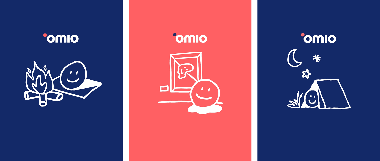
This is one of my favorite campaigns I did while working as an In-House-Designer at Omio.
As you might know, the travel industry has two peak seasons: Summer and Christmas. In this case, the marketing stakeholders wanted to make a campaign in between peaks, to improve overall conversion.
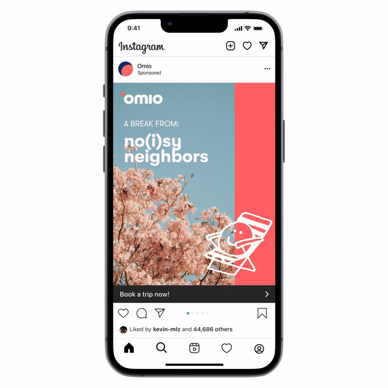
We focused on the spring break or Easter holidays. The brief mentioned something about breaking out of winter and routine. A quick escape to take a fresh breath before the summer holidays.
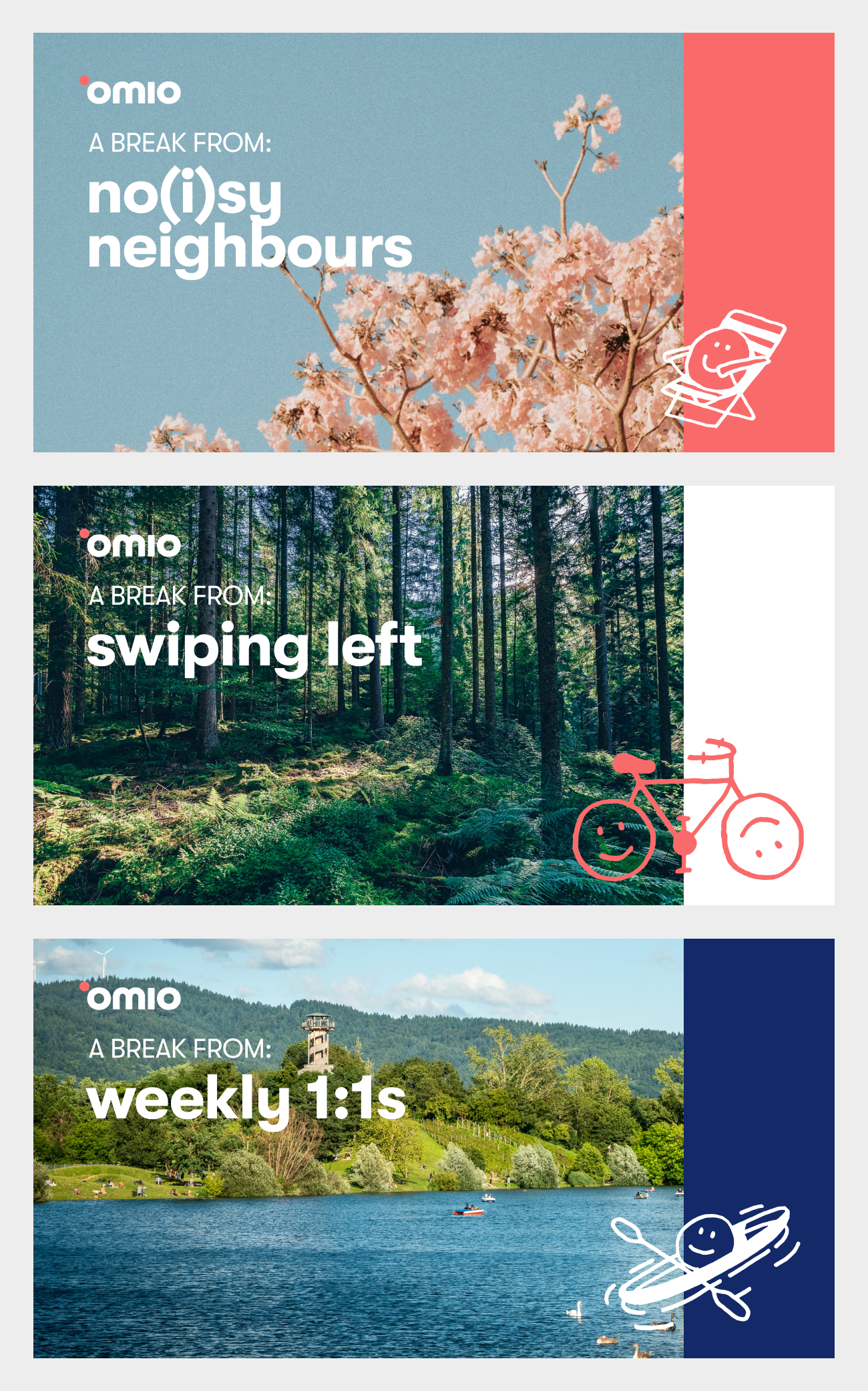
Working together with the copywriter we decided to use different common expressions and work-related terms that resonate with the customers routine, so they want to take a break from it.
As supporting images, we picked some with a lot of nature and spring vibes. Additionally, I pushed for the tiny illustrated smileys to give a positive energy to the whole campaign.
Once the concept was ready I worked on different executions for the final creatives, then presented them to the Creative Director. After some tweaks we were all happy with the final designs!
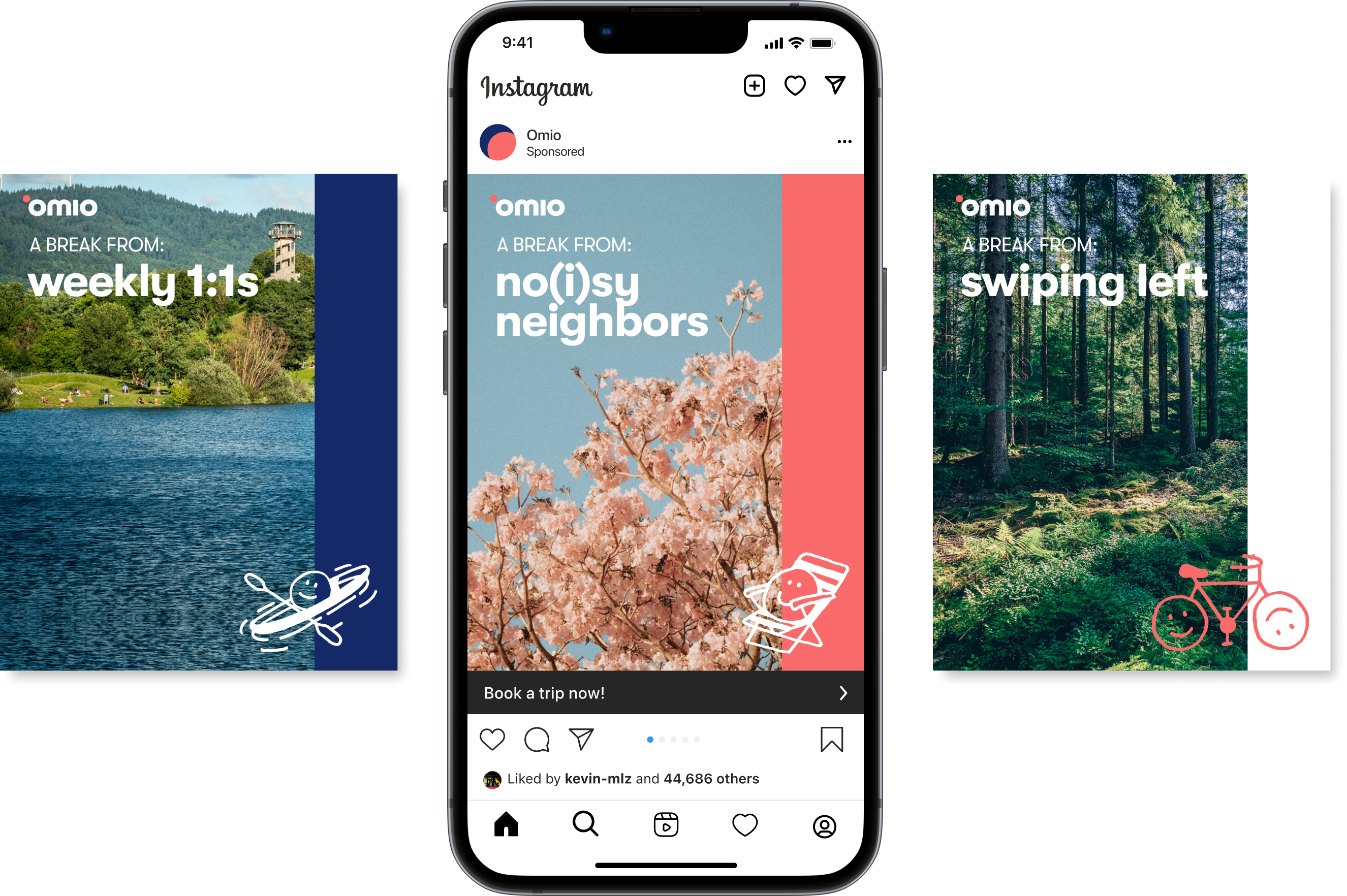
With the final art approved I moved on to generate all the assets for all the channels we were gonna use for the campaign: Newsletter, Google Ads, PR, Social Media (Instagram, TikTok). Each one, with their own stakeholder and restraints and specs.
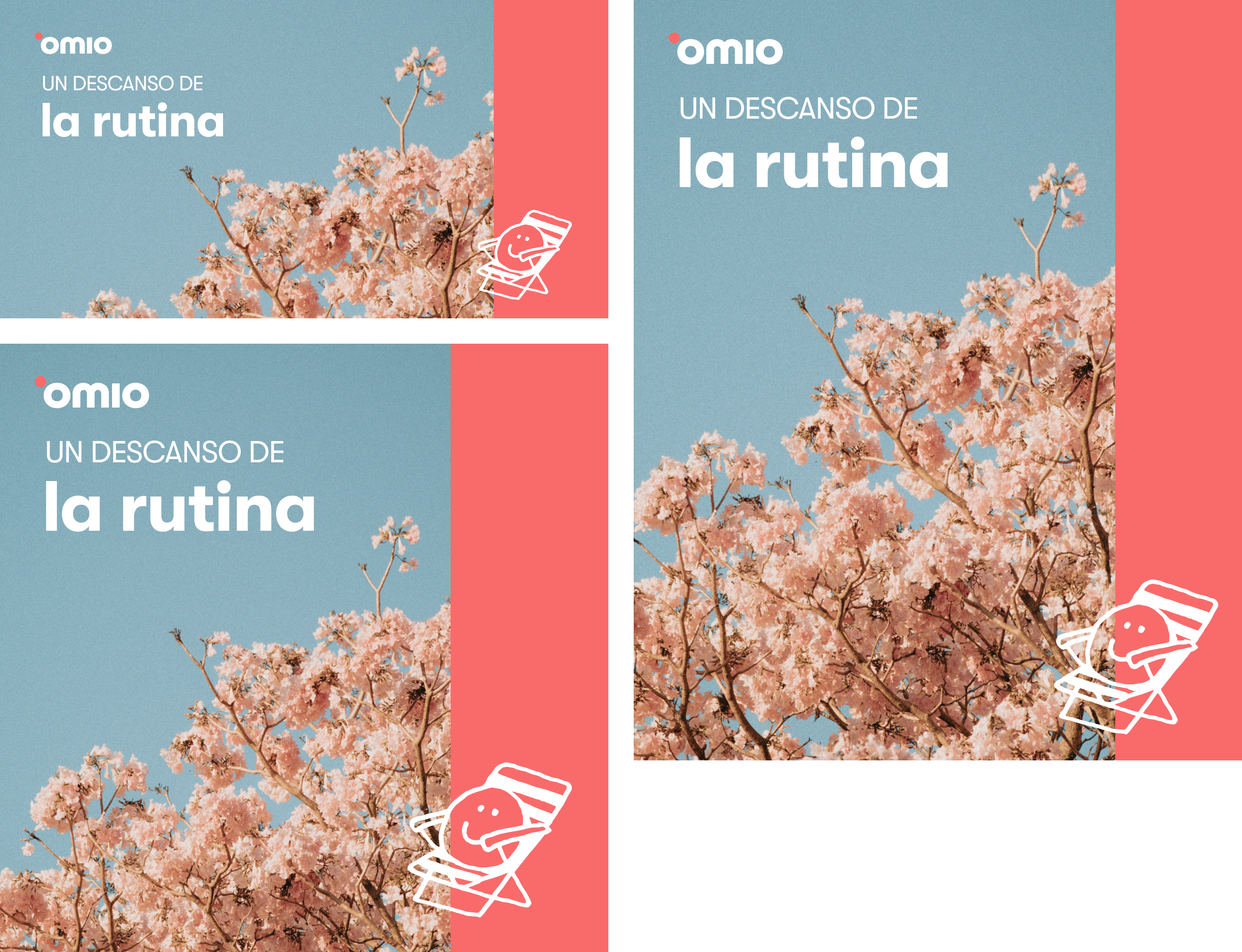
As a designer, creating all the different assets for a campaign can get pretty complex. It’s not just about the visuals, but also about making sure everything works across multiple languages and cultures.
Figma helps a lot to keep things organized, but when you’re dealing with translations for over 30 countries like Omio does, it’s no small task.
Using data sheets helps keep track of all the different language versions, making sure everything stays consistent and true to the message, while also respecting the unique needs of each market. It’s a lot of work, but it’s what makes the campaign connect with people all around the world.
Animated content is a game-changer for campaigns—it grabs attention and keeps it. For this project, I teamed up with an animator to create quirky, fun ads featuring the "Smiley Guy." These playful animations brought personality to the campaign and worked perfectly across social media channels. The collaboration made the campaign memorable and engaging—proof that the right visuals can truly elevate a message.

Creating app store assets is about making that first impression count. These screens need to showcase the app's value instantly, with visuals that feel clean, approachable, and on-brand. For this project, I was in charge of designing the creative assets for the app store listings, focusing on telling a story through each screen while staying true to the app’s personality.
Keeping these assets fresh is just as important as designing them. Regularly updating the visuals to match the app’s latest features or seasonal trends helps improves performance and keeps the listing engaging. I worked on iterations to ensure the screens remained relevant and competitive in a fast-moving space.
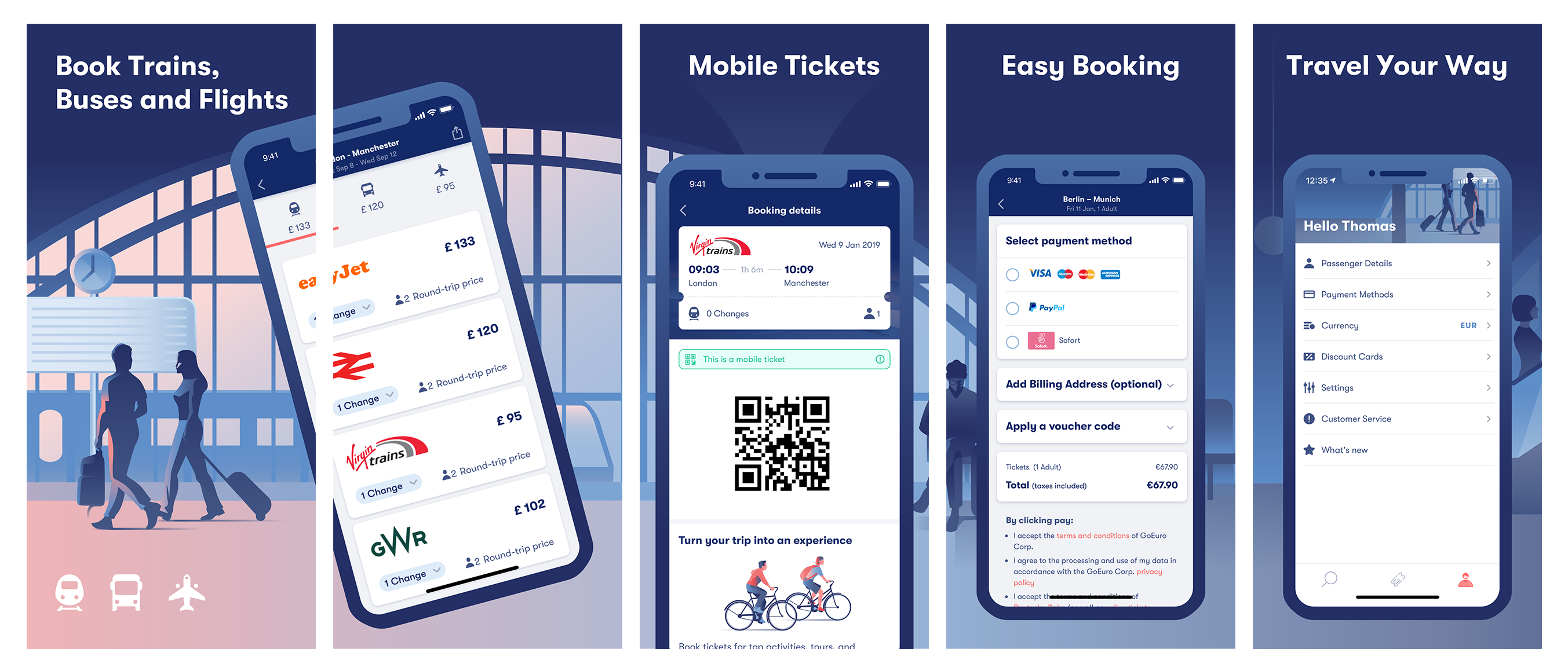
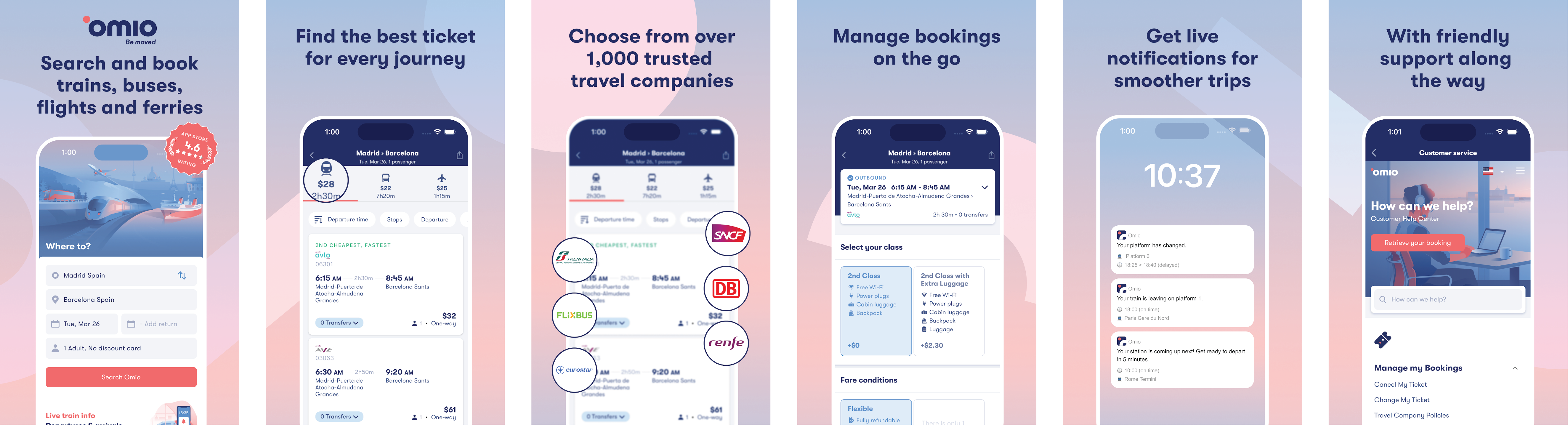
Translations were a big part of the process. It wasn’t just about swapping text but adapting layouts and visuals to fit different languages and cultural nuances. Every detail, from font size to image placement, had to work seamlessly across multiple regions.
One of the trickiest parts? Capturing screenshots of a live app in all the required languages and user flows. It meant navigating various screens, steps, and device formats while maintaining consistency.
Coded by Luis Alonso 2024.
© All rights reserved.